Css常用操作
Css骚操作
本文主要记录CSS常用的一些方法,比如水平居中呀,渐变色,文本选中样式等等。
设置字体为渐变色
background-image: linear-gradient(223deg, #7C58FF 0%, #AC2CFE 100%);
-webkit-background-clip: text;
color: transparent;
水平垂直居中
absolute+transform,绝对定位配合平移实现
.parent {
    width: 200px;
    height: 200px;
    position: relative;
    .son {
        width: 100px;
        height: 100px;
        position: absolute;
        left: 50%;
        top: 50%;
        background-color: #3576e0;
        transform: translate(-50%,-50%);
    }
}
absolute +负margin
.parent {
    width: 200px;
    height: 200px;
    position: relative;
    .son {
        width: 100px;
        height: 100px;
        position: absolute;
        left: 50%;
        top: 50%;
        background-color: #3576e0;
        margin-left: -50px;
        margin-top: -50px;
    }
}
absolute + margin:auto
.parent {
    width: 200px;
    height: 200px;
    position: relative;
    .son {
        width: 100px;
        height: 100px;
        position: absolute;
        left: 0;
        top: 0;
        bottom: 0;
        right: 0;
        background-color: #3576e0;
        margin: auto;
    }
}
::after实现
.parent {
    width: 100%;
    min-height: 200px;
    text-align: center;
    &::after {
        content: '';
        height: 100%;
        display: inline-block;
        vertical-align: middle;
    }
    .son {
        width: 100px;
        height: 100px;
        background-color: #3576e0;
    }
}
边框字体同色
border: 1px solid currentColor;文本选中样式
::selection { background: #e2eae2; }
::-moz-selection { background: #e2eae2; }
::-webkit-selection { background: #e2eae2; }
渐变色
#colorbox {
    background: #629721;
    background-image: -webkit-gradient(linear, left top, left bottom, from(#83b842), to(#629721));
    background-image: -webkit-linear-gradient(top, #83b842, #629721);
    background-image: -moz-linear-gradient(top, #83b842, #629721);
    background-image: -ms-linear-gradient(top, #83b842, #629721);
    background-image: -o-linear-gradient(top, #83b842, #629721);
    background-image: linear-gradient(top, #83b842, #629721);
}
表格斑马线
tbody tr:nth-child(odd) {
    background-color: #ccc;
}
单行文本省略
width: 120px; // 必须有宽度
overflow:hidden;
text-overflow:ellipsis;
white-space:nowrap;
多行文本省略
width: 200px;
overflow: hidden;
text-overflow: ellipsis;
display:-webkit-box;
-webkit-box-orient: vertical;
-webkit-line-clamp:2; // 省略行数
font属性缩写
font-style | font-variant | font-weight | font-size | line-height | font-family
font-family(字体族): “Arial”、“Times New Roman”、“宋体”、“黑体”等;
font-style(字体样式): normal(正常)、italic(斜体)或oblique(倾斜);
font-variant (字体变化): normal(正常)或small-caps(小体大写字母);
font-weight (字体浓淡): 是normal(正常)或bold(加粗)。有些浏览器甚至支持采用100到900之间的数字(以百为单位);
font-size(字体大小): 可通过多种不同单位(比如像素或百分比等)来设置, 如:12xp,12pt,120%,1em
p {
  font: italic small-caps bold 1.2em/1.0em Arial, Tahoma, Helvetica;
}
九宫格布局
.grid{
  display: grid;
  grid-template-columns: repeat(3, 1fr); /* 相当于 1fr 1fr 1fr */
  grid-template-rows: repeat(3, 1fr); /* fr单位可以将容器分为几等份 */
  grid-gap: 1%; /* grid-column-gap 和 grid-row-gap的简写 */
  grid-auto-flow: row;
}
.grid>div{
  color: #fff;
  font-size: 50px;
  line-height: 2;
  text-align: center;
  background: linear-gradient(to bottom, #f5f6f6 0%,#dbdce2 21%,#b8bac6 49%,#dddfe3 80%,#f5f6f6 100%);
}
<div class="square">
  <div class="square-inner grid">
    <div>1</div>
    <div>2</div>
    <div>3</div>
    <div>4</div>
    <div>5</div>
    <div>6</div>
    <div>7</div>
    <div>8</div>
    <div>9</div>
  </div>
</div>
圣杯布局
flex布局
头尾固定,中间自适应,或者头部固定,剩余部分自适应,或者尾部固定,剩余部分自适应
<!doctype html>
<html lang="en">
<head>
<meta charset="UTF-8">
<title>圣杯布局</title>
<style type="text/css">
body,div,p,ul,ol,li,dl,dt,dd,table,tr,td,form,hr,fieldset,h1,h2,h3,h4,h5,h6,img,input{
margin:0;
padding:0;
}
html,body{
height: 100%;
}
body{
display: -webkit-flex;
-webkit-flex-direction:column;
}
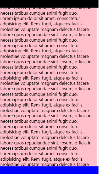
header{
width: 100%;
height: 80px;
background: black;
}
footer{
width: 100%;
height: 80px;
background: blue;
}
section{
width: 100%;
-webkit-flex:1;
background: pink;
overflow-y:scroll;
overflow-x: hidden;
}
</style>
</head>
<body>
<header></header>
<section>
<p>Lorem ipsum dolor sit amet, consectetur adipisicing elit. Rem, fugit, atque ex facilis molestiae voluptate magnam delectus facere labore quos repudiandae sint. Ipsum, officia in necessitatibus cumque animi fugit quo.</p>
这里请输入更多的内容,section部分会实现自适应
</section>
<footer></footer>
</body>
</html>box布局
<!doctype html>
<html lang="en">
<head>
<meta charset="UTF-8">
<title>圣杯布局</title>
<style type="text/css">
body,div,p,ul,ol,li,dl,dt,dd,table,tr,td,form,hr,fieldset,h1,h2,h3,h4,h5,h6,img,input{
    margin:0;
    padding:0;
}
html,body{
    height: 100%;
}
body{
    width: 100%;
    height: 100%;
    overflow: hidden;
    display: -webkit-box;
    -webkit-box-orient: vertical;
    -moz-box-orient: vertical;
}
/* 头部 */
header {
    width: 100%;
    height: 90px;
    line-height: 90px;
    text-align: center;
    background-color: #fff;
}
/* 内容 */
section {
    -moz-box-flex: 1;
    -webkit-box-flex: 1;
    width: 100%;
    overflow: auto;
}
/* 底部 */
footer {
    width: 100%;
    height: 90px;
    background-color: #fff;
    text-align: center;
    line-height: 90px;
}
</style>
</head>
<body>
    <header></header>
    <section>
        <p>Lorem ipsum dolor sit amet, consectetur adipisicing elit. Rem, fugit, atque ex facilis molestiae voluptate magnam delectus facere labore quos repudiandae sint. Ipsum, officia in necessitatibus cumque animi fugit quo.</p>
        这里请输入更多的内容,section部分会实现自适应
    </section>
    <footer></footer>
</body>
</html>
grid布局

<!DOCTYPE html>
<html lang="en">
<head>
  <meta charset="UTF-8">
  <meta name="viewport" content="width=device-width, initial-scale=1.0">
  <title>测试</title>
  <style>
    html,body {
      height: 100%;
    }
    header,footer {
      height: 90px;
      border: 1px solid #ccc;
    }
    .container {
      height: 100%;
      display: grid;
      grid-template-rows: auto 1fr auto;
    }
  </style>
</head>
<body>
<div class="container">
  <header>header</header>
  <main>main</main>
  <footer>footer</footer>
</div>
</div>
</body>
</html>
Css变量&进度条

明一个自定义属性,属性名需要以两个减号(
--)开始,属性值则可以是任何有效的CSS值
:root {
  --main-bg-color: brown;
}
element {
  background-color: var(--main-bg-color,red); // 当 --main-bg-color undefined的时候为red
}
三角形

div {
  width: 0;
  border: 100px solid;
  border-color: red transparent transparent transparent;
}
卡券效果
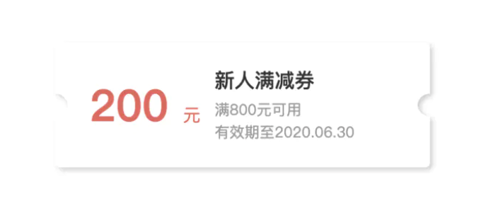
.coupon{
  width: 300px;
  height: 100px;
  position: relative;
  background: radial-gradient(circle at right bottom, transparent 10px, #ffffff 0) top right /50% 51px no-repeat,
    radial-gradient(circle at left bottom, transparent 10px, #ffffff 0) top left / 50% 51px no-repeat,
    radial-gradient(circle at right top, transparent 10px, #ffffff 0) bottom right / 50% 51px no-repeat,
    radial-gradient(circle at left top, transparent 10px, #ffffff 0) bottom left / 50% 51px no-repeat;
  filter: drop-shadow(2px 2px 2px rgba(0,0,0,.2));
}
// 也可以选择使用两个微元素::before 和::after来实现
flex下margin的奇效

.container {
  display: flex;
}
.container>div {
  width: 20px;
  height: 20px;
  background-color: #3576e0;
  color: #ffffff;
  text-align: center;
}
.container div:nth-child(5) {
  margin-left: auto;
}
<div class="container">
  <div>1</div>
  <div>2</div>
  <div>3</div>
  <div>4</div>
</div>
兄弟选择器的妙用

ul {
  list-style: none;
  padding-left: 0;
  text-align: center;
  border: 1px solid red;
}
ul>li+li {
  border-top: 1px solid red;
}
定宽等高

div {
  width: 50px;
  background-color: #3576e0;
  color: #ffffff;
  display: flex;
}
div::after {
  content: '';
  padding-top: 100%;
}
<div>我是傻逼</div>
饼状图
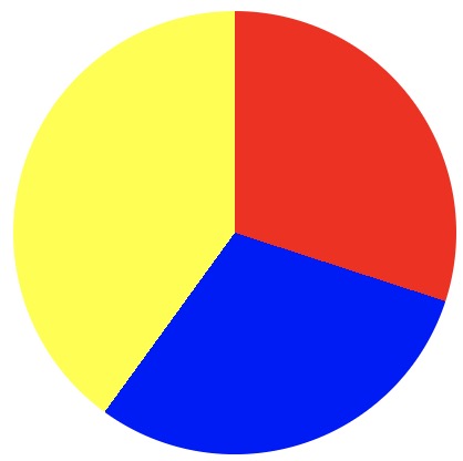
div {
  width: 200px;
  height: 200px;
  border-radius: 50%;
  background: conic-gradient(red 0 30%, blue 30% 60%, yellow 60% 100%);
}
哀悼专用全栈变灰

html {
  filter:progid:DXImageTransform.Microsoft.BasicImage(grayscale=1);
  -webkit-filter:grayscale(100%);
  -moz-filter:grayscale(100%);
  -ms-filter:grayscale(100%);
  -o-filter:grayscale(100%);
  filter:grayscale(100%);
  filter:gray;
}本博客所有文章除特别声明外,均采用 CC BY-SA 4.0 协议 ,转载请注明出处!